Eco-design and design

Throwback to the conference "How to approach design in an eco-design approach" by Damien and Alizée from LunaWeb at MixiT 2023.
A first inventory raises the following question: do we make enough of those around us aware of the theme of eco-design? When we know that 3,8% of greenhouse gases are generated by digital technology and France will triple its carbon footprint by 2050, it is clear that we must change our habits and do some pedagogy.
3 simple actions to implement to reduce our carbon footprint
- Better choose your terminal purchase
- Prefer wired or wi-fi connection rather than mobile data (4G consumes 23 times more energy than wifi)
- Keep your terminal as long as possible before reselling or recycling it)
Eco-design will not impose itself as a standard. We must multiply the actions to achieve that it becomes a reflex. And for eco-design to make sense and be effective, you have to intervene early in the redesign or construction of a project.
An eco-designed site is generally faster, promotes conversion, facilitates maintenance and reduces maintenance costs. For example, each search on Yahoo is about 5 times more polluting than the same search on Google.
The winning formula for eco-design
Utility X Speed X Accessibility
to meet two objectives:
- Reduce the time spent by the user by designing services that best meet their objectives
- Increase the lifespan of terminals
The eco-design toolbox
- The RGESN (General repository for the eco-design of digital services) constitutes a good working basis even if some criteria are vague and others declarative: https://ecoresponsable.numerique.gouv.fr/publications/referentiel-general-ecoconception/
- The design studio, a methodology inspired by agile methods to bring together a cross-functional team to imagine design solutions
- EcoIndex, a sort of PageSpeed Insight but to assess the carbon footprint of a site with quantifiable data as well as the various areas for improvement. https://www.ecoindex.fr
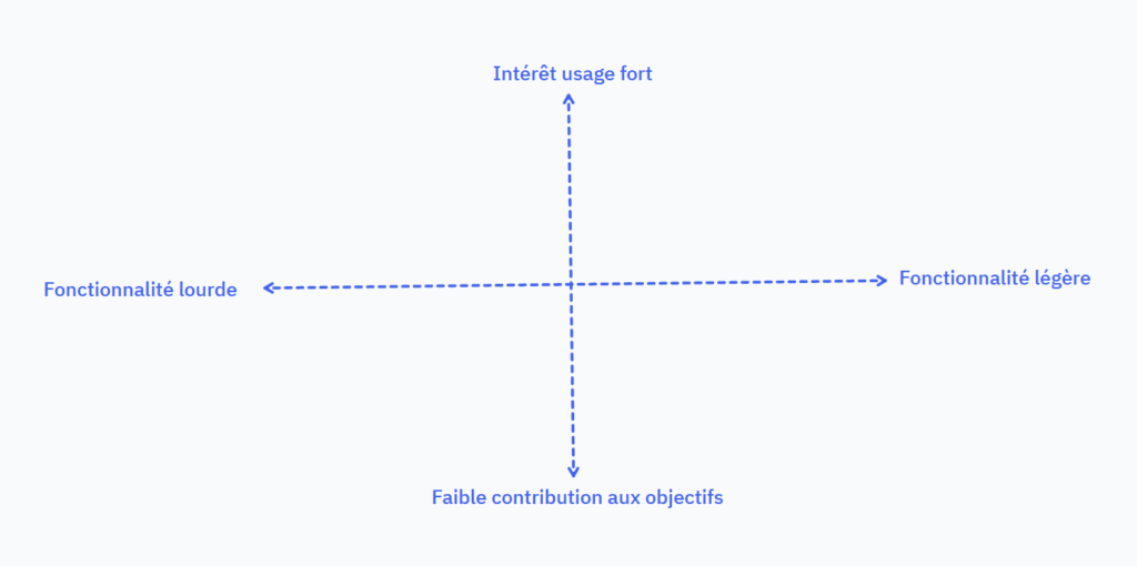
- The skimmer method which comes in 4 steps:
- The divergence phase
- The company imagines the offer it wishes to offer
- Users list their needs
- Designers pool their ideas
- Finally, the participants will place each of the functionalities on the following table:
- The heart method
- Hide: hide a feature on a page to place it elsewhere
- Delete: delete an unnecessary element
- Reduce: simplify or minimize information
- Standardize: harmonize several components to minimize the mental load
Obviously, whatever the site, it must be mobile-first because 59% of traffic is mobile.
Eco-design, development side-front
The main vectors for improvement lie in the use and optimization of images. As a preamble, I take this opportunity to make a small aside, you have to understand that the larger the image, the greater its weight and the longer it will take to load. In the same way, the more images the site contains, the more HTTP requests there will be, so the less eco-designed the site will be. This is why it is appropriate for a web page not to exceed 1920x, to use lazyloading and to limit the number of images. There are several tools to resize images like Photoshop.
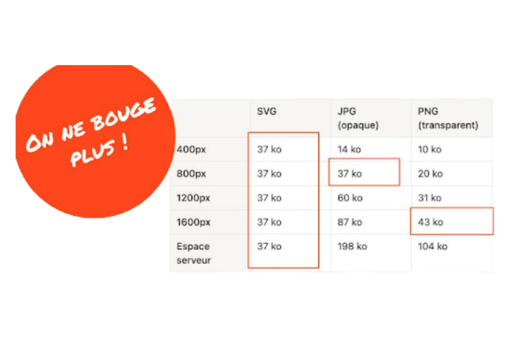
As for the formats to choose from, none brings together all the advantages. THEThe question should be asked according to the expected result. SVG, for example, has a satisfactory compression rate allowing a reduction in the weight of the image but can also damage its quality. PNG supports transparency but may have low compression. As for WebP, it offers up to 30% greater compression than other tools but is not compatible with all browsers.
Moreover, fonts represent 6% of the weight of the pages, on average. This is why it is important not to load too much, so it is advisable to load only one font for the titles and to use the system fonts for the text.
In conclusion, ultimately there is no magic recipe, no ultra-sophisticated tools, we say death to techno-solutionism and yes to common sense and frugality ! We purify the products as much as possible, we avoid unnecessary and/or heavy functionalities. We optimize all the images and above all we do not necessarily favor one format over another. Let's make sites fast, usable by all and also suitable for older smartphones!